Stock Market Data

The world is awash in large amounts of data and statistics and probability can help us make sense of it. Today, we are collecting financial data, data on ourselves and data from nature.

The stock market is at the center of the United States economy. Even if you have no money in the stock market it still affects you. In future labs we will use the Excel and graph data that you collect today.
  • Work in groups of 2 or 3 people (work on 1 computer).
  • On the front board, put up the actively traded stock symbol (and it's meaning) that you wish to track [one stock per group - first come, first served]

    Getting Historical Data from Yahoo and Converting it to an Excel Chart
    Follow Carefully!

    Finding the Data
  • Go to finance.yahoo.com, enter your stock symbol in the Search box and look it up.
  • Go to the Historical Data menu link and change to 3M. Then click Done.
  • Click on Apply. Scroll down to make sure the data has approximately the correct start date.
  • Then scroll back up and click on Download Data and then open the .csv file, which may automatically open in Excel.
  • If the file doesn't automatically open in Excel, either double click to open it in Excel, or from Excel, under File, release on Open [You may need to Enable: All Files if it doesn't let you select the .csv file].

    Changing Format and Saving Your File
  • Under File, release on Save As...
  • Using the pull down options, change the Format from CSV (Comma Delimited) to Excel Workbook (.xlsx) at the very top of the File Format options, so that Excel can open it again later.
  • Check that Excel automatically changed the file extension to xlsx (not xls)
  • As you do this, change the file name to
    1010stocksymbol.xlsx
    (for example 1010BRKA.xlsx) and save. Be sure there aren't any spaces!


    Working With the Data in Excel to Create a Chart
  • Notice that the Date will be in the first column, Open price in the second [the price at the start of the day], High price that day in the third, Low price in the fourth, Close price in the fifth [the price at the end of the day], Volume in the sixth [the # of shares bought and sold in a day], and Adj. Close* in the seventh. You read about these in the homework reading on Investments for today--ask me any questions you have on them as I make my way around!
  • Make sure the Date is in increasing order, starting at about three months ago. If not, ask me to help you as I make my way around.
  • Click on B1
    Go to the very top of the screen, outside of the Excel sheet, to Insert and release on Columns.
    Now there is an empty column between date and open.
  • Click on the gray box H just above where the Volume is so that the entire Volume column is highlighted.
    At the very top again, but now under Edit release on Cut
    Click on the gray box B (the empty column)
    Under Edit release on Paste
    Notice that now our columns look like Date - Volume - Open - High -Low - Close - Adj. Close*
  • Click on the gray box G, above where the Adj. Close* is located, and under Edit, release on Delete.
    Notice that now our columns look like Date - Volume - Open - High -Low - Close

  • Saving Your File Again Save your excel document again - under File, release on Save.


    To create our Excel graph
  • Click on the grey box B
  • Click on the Command key on the keyboard and hold this key down.
    Continue to hold the key down as you click on the grey boxes C then D then E then F.
    Then columns B thru F will all be selected in that order.
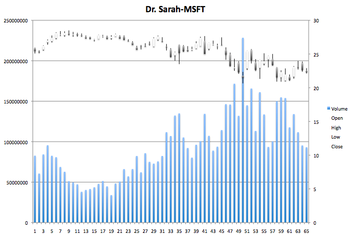
  • In the Excel sheet (NOT outside this time), near the Home menu, go to Insert, look near the Recommended Charts for the Stock chart Volume-Open-High-Low-Close and you should see a stock graph that looks something like the one here (if not, redo the above--try selecting the columns again and make sure nothing else is selected).
  • Change the Chart Title to add your first names and your stock symbol.
  • So it will look something like the graph on the right, with Volume as the bars on the bottom of the graph (corresponding to the numbers on the left), and the prices on the top and the right, in what look like boxplots.

  • Save the file again
  • Next, outside the Excel sheet at the top, under File and then Page Setup, choose the Landscape Orientation and hit ok
  • Hold down the control key on the keyboard and select the Chart by clicking on it.
  • Select Move Chart
  • Select New Sheet and click Ok

    Save the file again

  • Try to print your chart--[1 for each person]--the printer is in the next room. You can also print this sometime outside of class. You want a full size printout of the graph, which we will use as we analyze the data.
  • Check that the chart is in one tab (at the bottom) and the data at the other.

    Save the file again

  • Also email every group member a copy of the xlsx file
    You will use the file again in numerous future labs, so do not delete it.

    Part 2 and 3 of Lab
    The next activity is to work on the Anonymous Class Data Collection on ASULearn and the third activity is the Statistics of Nature link on the class highlights page.