Using stocks, it is easy to find graphs that show that
different representations of similar data can be used to illustrate
conflicting viewpoints.
My stock is called NITE. Using the web page
http://finance.yahoo.com/q?s=nite&d=c&k=c4
I changed the range to choose two different time frames that
showed conflicting information.
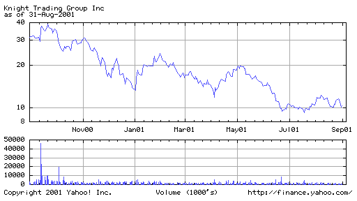
This one year graph showed a marked decreased in the NITE stock
from 30 to 10. The top part of the graph shows the price of the stock,
while the bottom shows the volume or number of shares bought or sold each
day.
While there were fluctuations in the stock value,
this graph shows that NITE decreases with time.

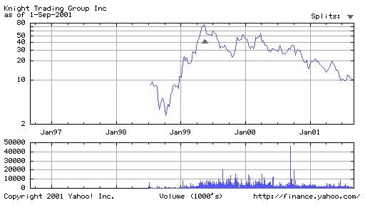
On the other hand, this 5 year graph of Nite prices shows that
NITE started and finished at the same price of 10. In between,
starting at around June, 1998, NITE first decreased, then increased
significantly, and then decreased at a slower rate.

We have shown that
different representations of similar data can be used to illustrate
conflicting viewpoints. Using the 1 year graph, we see that
NITE decreased, while the 5 year graph shows a different story
of NITE starting and finishing at the same price.
When looking at data, both longterm and shortterm viewpoints must
be considered for an accurate representation.

