The following graph shows the
Nasdaq composite, which consists of many technology
stocks.
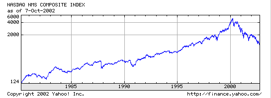
Notice that the x axis is time, and the y-axis is the price.
Notice that the y-axis is unequally spread out.
Before 2000, you can see that even though there were many
fluctuations, the stock followed a clear upward trend.
But, it is hard to tell how well the data would fit the
trend line Excel would draw without the r2 value.
Excel can always find the best fit line, even in data that
doesn't seem to follow a trend (which would then be reflected
in a low r2 value). Looking at the graph from 2000 until it ends,
we see a steep downward trend.
The trend line over the entire time is still upward.
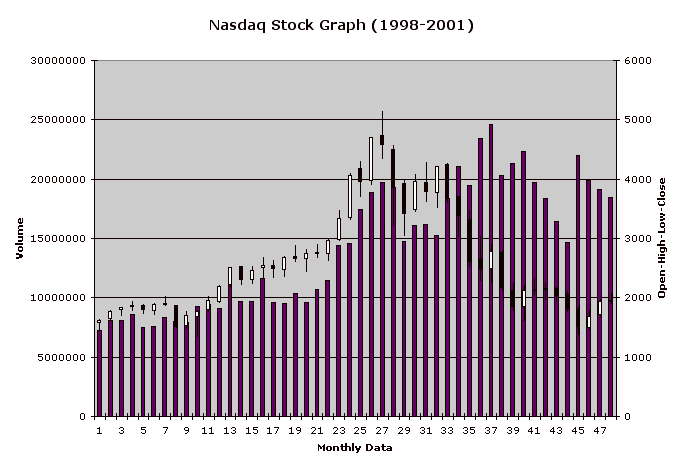
The following shows an Excel stock graph of monthly data
from 1998-2001. Just like your own stock graph,
the x-axis is the month (on your stock graph it is the day),
and the purple bar chart show the volume
(which is read by going to the numbers on the left).
The black and white boxes look like boxplots, but they are not.
They show the open, high, low and close prices
(high is the highest price a stock reaches in a given day,
and is at the top of the corresponding graph for that day) by going over
to the numbers on the right.
We can see from this graph that volume would not be a good predictor
of high. If volume was a good predictor of high, we should see
some kind of correlation between them:
In fact, we can see all sorts of contradictions to a reasonable correlation
between high and volume:
for example, from months 25 to 26, we see that the volume increases
as the high increases, but from
months 35 to 36, we see that the volume increases as the high
decreases (look carefully at the declining high, which can be seen
atop the purple bars).
There are many such similar contradictions to a consistent
trend in this graph.
Hence, we expect volume to be a poor predictor of high.
This intuition is reinforced in the Excel linear regression scatter plot
of Volume and High.
In this plot, volume is on the x-axis and high is on the y-axis.
Excel plots the best fit line, but this does not fit the data very
well because there is no clear trend.
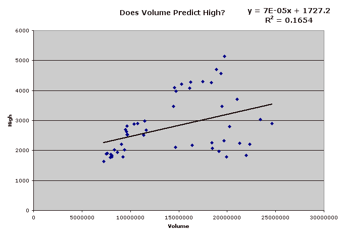 As we can see, the correlation R is positive, but low,
and Excel tells us that R2 is .1654 = 16.54%, which is a weak predictor,
according to the chart on R2 below:
As we can see, the correlation R is positive, but low,
and Excel tells us that R2 is .1654 = 16.54%, which is a weak predictor,
according to the chart on R2 below:
10% to 25% weak
25% to 65% moderate
above 65% strong
R2 measures how well the line fits the data, where fit means the y-value distances of the points.
Skim through these instructions for lab. Since it is a longer lab, some familiarity will help it go more smoothly:
Work in a group of 4, but each person should answer the questions on a separate piece of paper. Bungee jumping looks pretty exciting. Today we will let you decide how long to make the bungee cord for a fragile jumper -- a raw egg. The goal is to make it exciting but not fatal for your jumper. A small prize will be given to the group that gets closest to the ground without harming their egg. There is only 1 egg per group.
Make 3 jumps each with 2, 3, 4, and 5 rubber bands from a height of 1 meter. You may wish to use a pen, and hold it perpendicular to the top of the stick, so that you drop the egg sufficiently far away from the meter stick. Record how far the egg travels from the top of the meter stick to the point closest to the ground (12 data points). Be very careful with your egg - protect it from hitting anything and make sure that it doesn't swing back and hit the meter stick. Accuracy is important, so the same person should drop the egg each time, and the same person should be watching the meter stick each trial.
Enter your data into excel, Click on the grey A box above the number of rubber bands data. The column will become highlighted. Click the command key, hold this down and then then click on the grey B box above the distance data. Now both columns will be highlighted. Under the Insert menu, release on Chart. Click on XY (Scatter) and then on Marked Scatter. Use the control key as you click on one of the points on your graph. Release on Add Trendline. Click on Options and select the bottom two options (Display equation on chart and Display R-squared value on chart). Click on OK. Back on the chart, click on the equation of the line, hold down and drag it to the corner so that you can read the info.
Using the predicted number of rubber bands, the R2 value, and anything else you want to factor into your decision, decide how many rubber bands you will use for the 2.0 meter bungee jump. You may be creative and fold a rubber band in half. The team that comes closest to the ground without any egg damage wins.
Build, but DO NOT TEST the bungee machine and then put a slip of paper with your groups names and bring it up front in the bowl as you continue to work below. Your egg dropper will drop the egg when I bring us together, and I'll also need some volunteer judges.
Stock Market Data Download your stock file. Open Excel and then open your file using File/Open (yournamesotckname.xls).
For most stocks, Volume will be a weak or no predictor of High. Take out your Excel chart from the stock packet and look for contradictions to a general trend between Volume (the bars at the bottom) and High (the tip tops). Ie find two consecutive days where the volume increases over time as the high increases, and two other consecutive days where the volume increases over time as the high decreases, or find some other similar information that would contradict a good fitting line relating volume and high.